ECIR data tool
Loading...

Inequalities heatmap by country
Data source and links
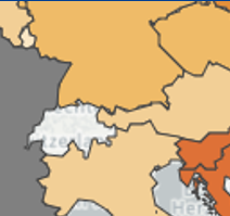


The shade of colour relates to the ranking of the data, according to the data range for each indicator in five categories. The countries coloured with the lightest shade were among the 20% of highest-performing countries for a given indicator in terms of cancer inequality. The grey colour indicates the data is unavailable for that particular country.
The heatmap chart displays countries performance, from top (highest performing) to bottom (lowest performing).
The orange shade stands for the quality of such performance: the lighter the shade, the better the country performs (for that given indicator) in terms of cancer inequality. The grey colour indicates the data is unavailable for that particular country.
The data represent the last available year for each indicator.
The data represent the last available year for each indicator.
About this indicator
Unit of measure
Source update frequency
References
Data
Metadata